
Crafting Better Journeys
How might an online youth journal become easier to explore, more inclusive, and simple for its own team to run?
A redesign of Pulse, the online youth journal of the Museum of Art & Photography (MAP), Bengaluru: a new information architecture, a custom design system and a Wix site that the MAP team can maintain on their own.
Role
UI-UX Design Intern
Museum of Art and Photography, India
Duration
Jan - May 2025
16-week Graduation Project, IICD Jaipur
Tools
Figma, Figjam
Wix, Wix Velo, Google Analytics
Context
A journal by young people, for young people

Pulse is an independent, collaborative space run by young adults to share creative work.
Each quarterly volume has its own theme: Work-in-Progress, Families: Found and Otherwise, In Transit and Love Punctuated.
The brief had two parts: redesign the site for a better user experience, and establish a design system for visual consistency and scale. The existing site was built on Cargo, with fixed templates, no drag-and-drop and weak mobile layouts.
Research
Primary and secondary findings
Heuristic evaluation
Audited the live site against Nielsen’s ten heuristics. Found a misleading “next stop” label, jargon like “Concept Note”, three different button styles, and no search, favourites or help.
Competitive analysis
Compared Pulse with Tate Collective, Art Journal Foundation, MoMA Teens, JAR and Indian Contemporary Art Journal, scored on layout, user journey, visual design, engagement and accessibility.
Interviews
Spoke with four former editorial panel members about first impressions, navigation, the Cargo platform and what they would change.
Process
Ideating


Designing
Elements of the website


Information Architecture Ideations
 |  |  |
|---|---|---|
 |  |  |
 | 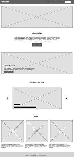 |  |
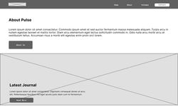
Low - Fidelity Wireframes
 |  |  |
|---|---|---|
 |
High - Fidelity Wireframes
Designing
Design system
Colour Palette
Primary neutrals (#272B2D and #F7F6EE) plus a web-safe palette coded to each volume.
Typography: Quicksand
Chosen to feel: young, creative, raw, expressive and meditative,
Components
Primary, secondary, hover and disabled buttons (36 px and 48 px heights), plus a responsive header and footer.
Development
Built so the team can run it
Content map
Tracker, Content and Alt Text tabs, updated with every site change.
CMS
Content in collections, with standardised names for collections, fields and filters.
Dynamic pages
Used to work around Wix’s 100 static page limit.
Wix Velo
Custom code for filters and full-article buttons.
Handover
Training the team

Day 1
Wix interface, templates and building the home page.
Day 2
Writing pages, Boolean fields and the video page.
Day 3
Illustration and photography pages, mobile design, Q&A.
Outcome
After launch
 |  |  |
|---|---|---|
 |  |  |
Analytics
Session duration rose from roughly one minute to eight, and unique visitors increased.
Reflection
Just some fun moments at MAP


